The trademark consists of the signet and the logotype “ComNets” as well as an optional subline. The trademark must always be used in the specified colour variants. Modified, reduced or coloured versions are not permitted under any circumstances. Font, shape, colour and spacing within the trademark are fixed.
The variant is intended for all coloured printed matter. An RGB version is available exclusively for digital application.
Standard
Compact
Subline German
Subline English
Black and white version
The black and white version is used where, for technical reasons, only grayscale reproduction is possible.
Standard
Compact
Subline German
Subline English
Negative version
This variant is ONLY used if the trademark is placed on a full-color, dark surface (primarily TU Blue).
Standard
Compact
Subline German
Subline English
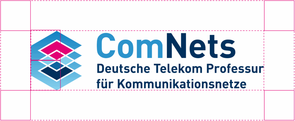
Protection zone around logo
The so-called protection zone describes a minimum space around the trademark that must not be touched by text or graphic elements. It guarantees an optimal effect of the trademark. The protection zone for the “ComNets” trademark is half the height of the signet.
Colours
The house colours can be used to structure texts and areas. The standard colour for continuous texts is TU Blue. Magenta is only used subtly as a markup color.
The TUD logo consists of a symbol and text. When used in medium to large formats, the combination of image and lettering is always used. The image and lettering must not be modified and should only be made bigger or smaller as a single entity. It is primarily used in the color blue or white on blue, depending on the color of the background. Attention must be paid to contrasts in order to ensure accessibility. In exceptional cases, it may also be in black.